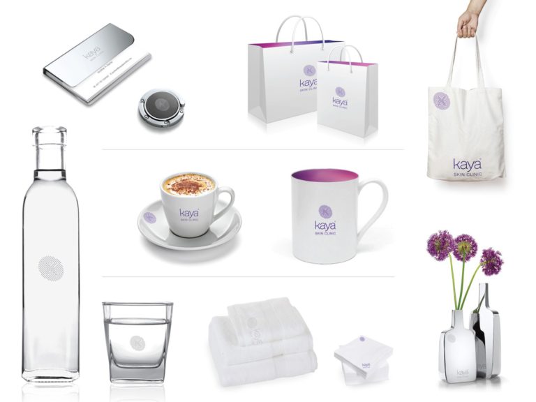
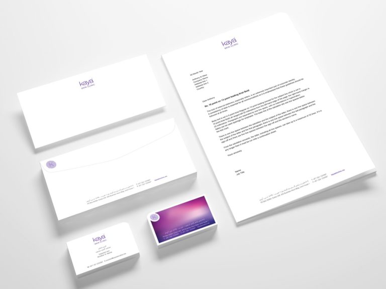
Kaya
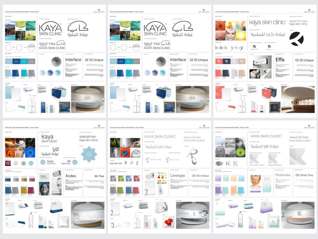
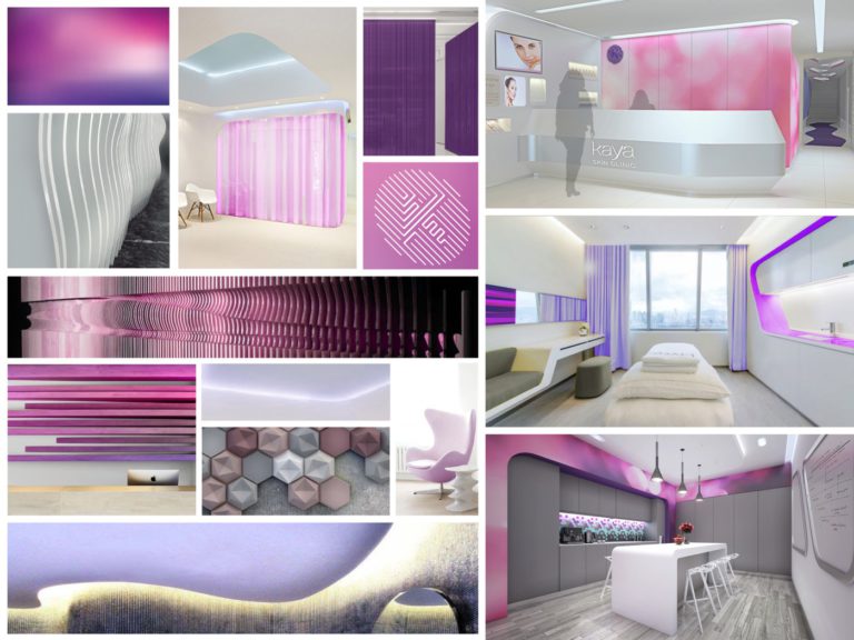
Kaya brings together the best of both worlds – creating a luxurious, relaxing, spa like environment staffed by dermatological and medical experts to provide best in class skin solutions across the Region. Rapid growth in this category has led to an influx of “me too” brands and Kaya needed to evolve to reclaim it’s dominant position and create a strong purpose to drive growth for the future.
Kaya at its best
Our strategy was to build Kaya’s brand from the inside out changing the culture from one of “sales” to one of “experience”. Shifting focus from products and services (what Kaya did) to focus on the individual customer (how Kaya does it). Our approach was about becoming more personal, putting the individual at the center and customising a solution that brings out their best using Kaya’s dermatology expertise and innovations. The brand promise captures the essence of the strategy “With Kaya its you, but you at your best”.
Awards
Transform Awards 2016
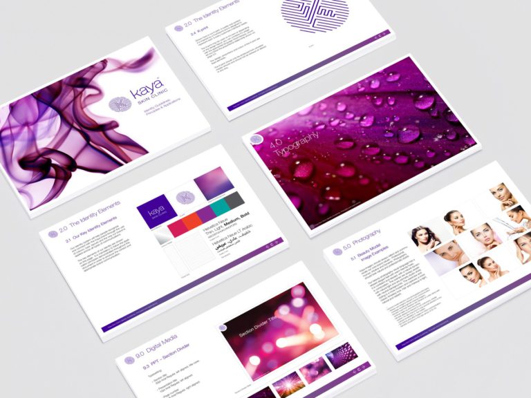
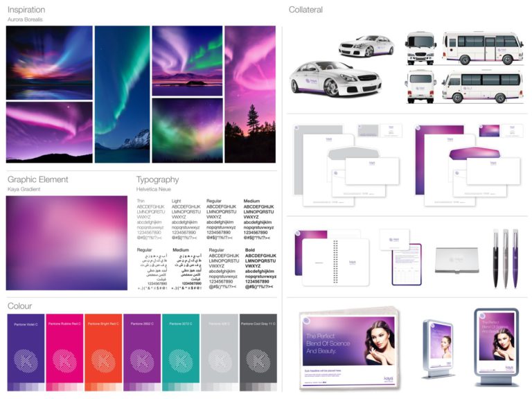
- Gold > Best visual identity from the healthcare & pharmaceuticals sector
- Gold > Best brand evolution
- Silver > Best creative strategy
- Bronze > Best implementation of a brand development project

