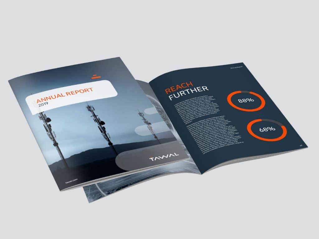
Tawal
Saudi Telecom Group (STC) owns the most advanced mobile network in Saudi Arabia. This is because it has the largest number of towers that exclusively connect their customers. With the constant cost of expanding and maintaining its network STC saw an opportunity to diversity its revenue stream and create a new tower network infrastructure company to service other telcosAnd so Tawal was born.
Tawal’s success depends on its ability to appeal to STC’s competitors. This meant the brand had to be independent of STC, neutral and, most importantly, inclusive: inviting competition to share in this large neutral network.

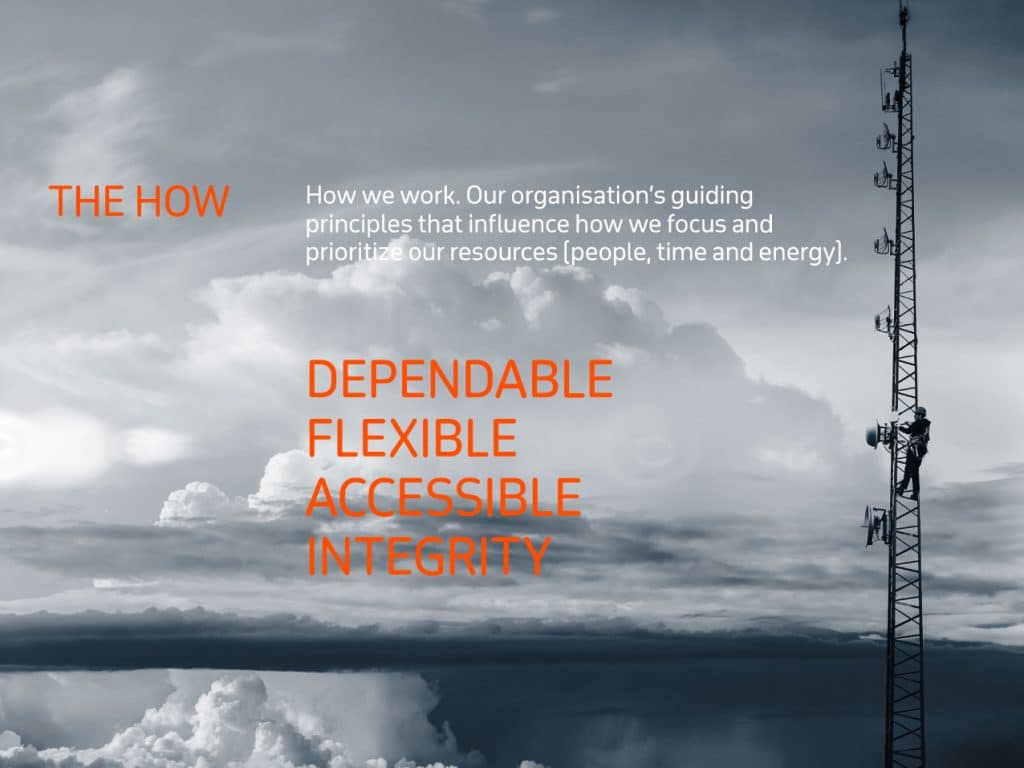
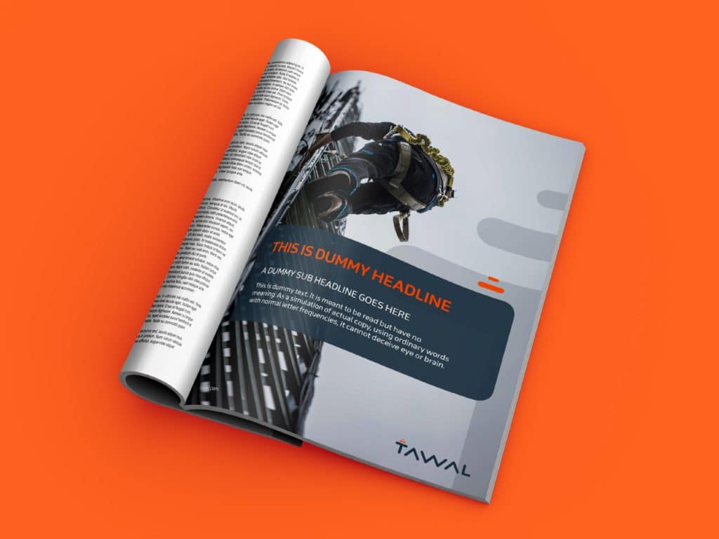
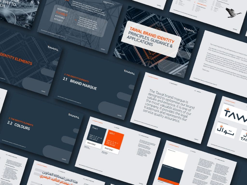
Bellwether positioned Tawal as _the_ company that would take care of infrastructure so that telcos spent less time, energy and resources on managing their network, and more on developing new areas for growth. The company’s purpose, vision, beliefs and promise were then clearly defined.
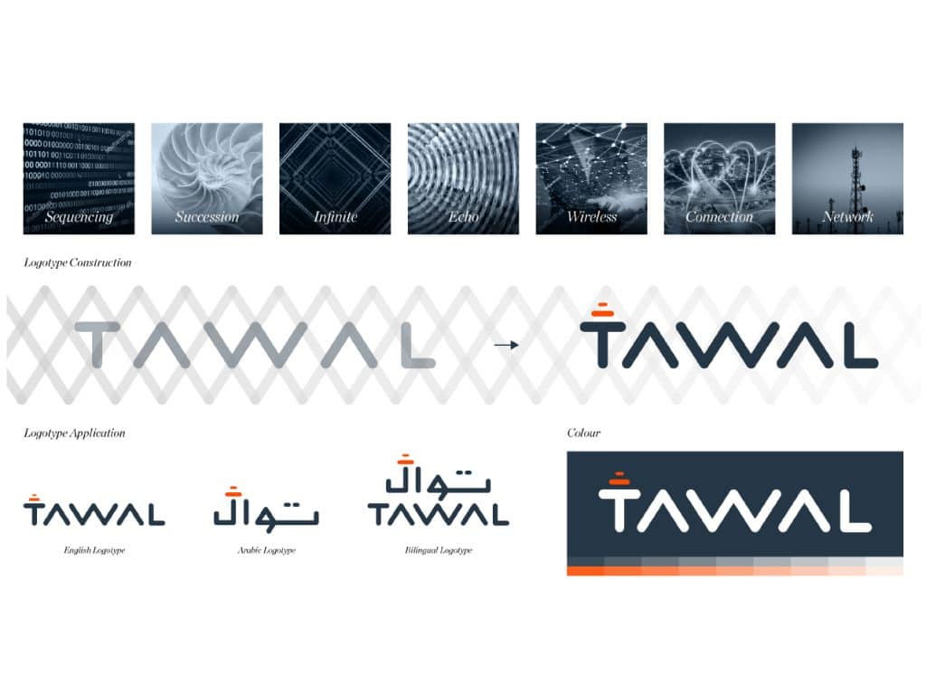
The name Tawal is an Arabic name which means sequencing and succession: a continuing and everlasting sequence representing the ongoing advancement of technology and communications.
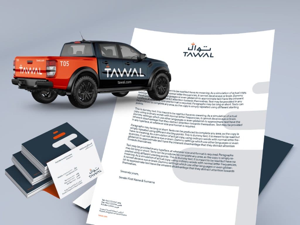
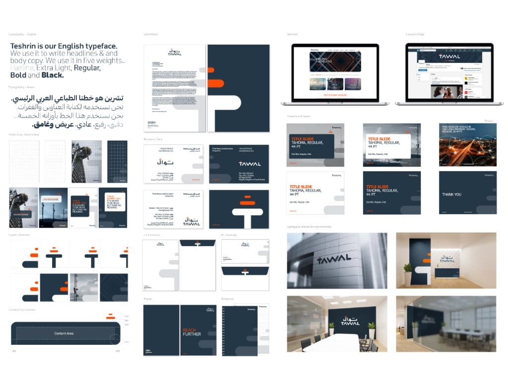
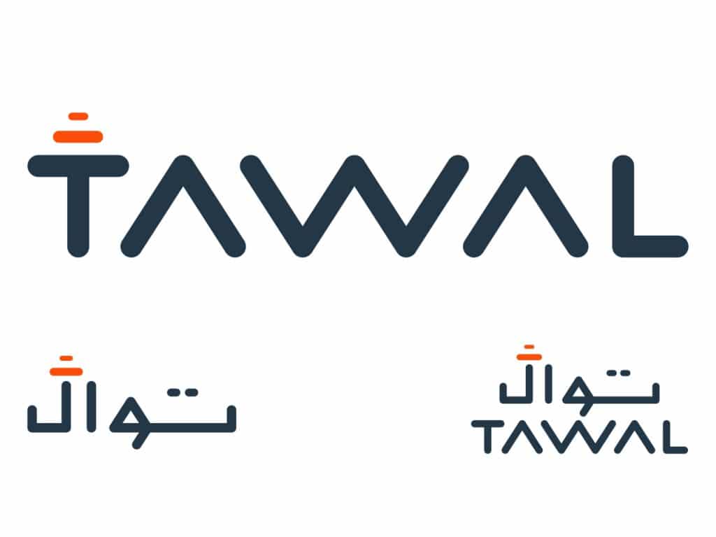
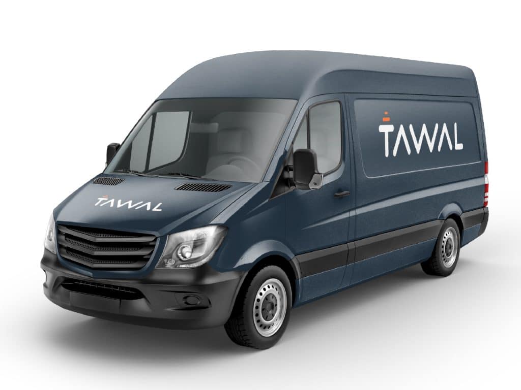
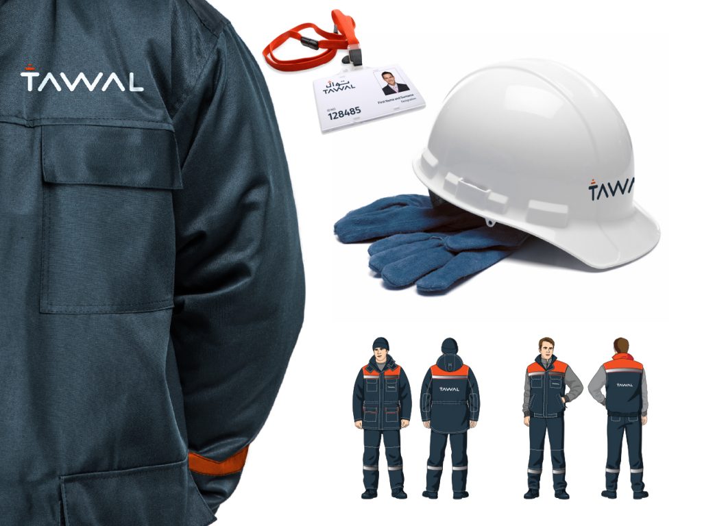
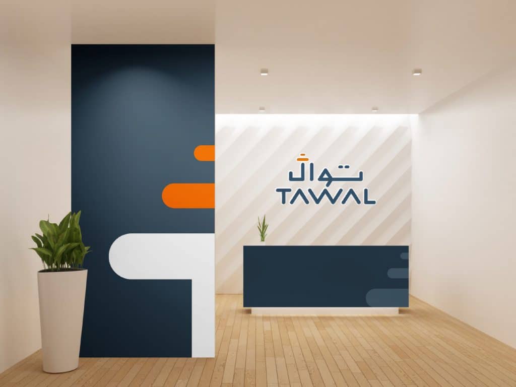
The logo design echoes the meaning of the name. It’s a logotype based on a continuous set of repeating graphic lines, and the type was constructed from this sequenced grid. A strong solid stroke weight was used to help express the brand beliefs of integrity and dependability which form a core part of the guiding principles we developed for Tawal.
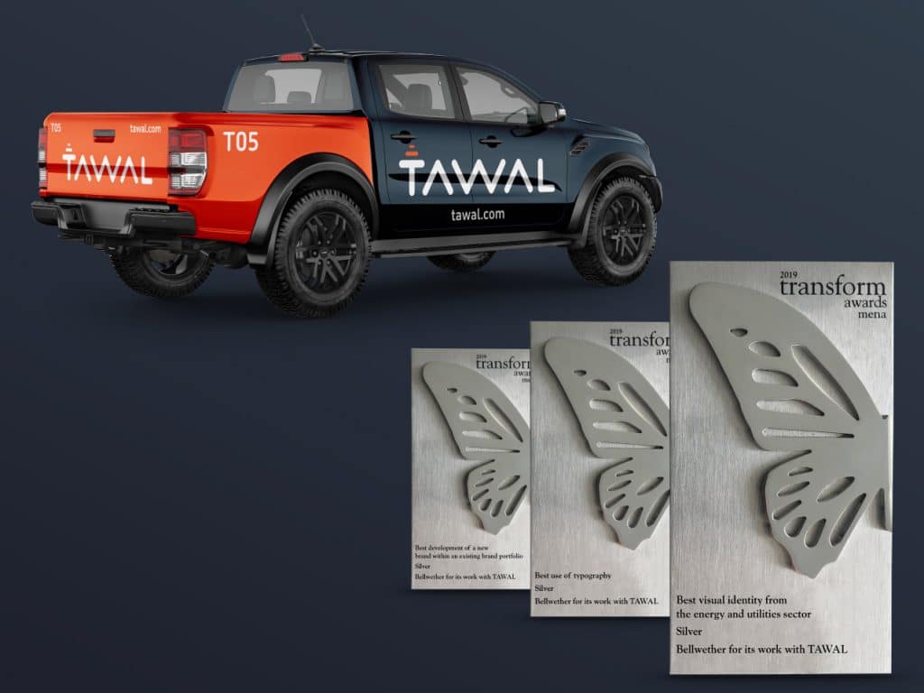
Awards
